Having a Ball at the Museum
A downloadable project
Intro
The assets for Having a Ball at the Museum were made as part of a cumulative project for a game art class at UCF in Spring 2021. All the assets featured here were made by me in Adobe Illustrator. The art style is inspired by Flash browser-based games from the 2000s. Movement is relatively simple and bright colors feature noticeably in the color scheme. I would like to eventually create a side-scroller game with these assets, but for now enjoy the art and mockups on this page. For more information check out the game's art bible at the bottom of the page in the Download section.
Narrative
On a school field trip to an art museum, a young kid accidently leaves their ball, named Bernie, on a bench. Having forgotten to be retrieved by the kid, Bernie spends the night at the museum. During this time, Bernie decides to see as much of the museum’s collection as he can. Rolling through the museum’s corridors and avoiding security, Bernie bounces up to collect as many pieces of art as possible before the night is over. Once the time is up and the sun rises, Bernie is returned to his owner. No matter what happens Bernie will have an interesting journey, but the more pieces of art he can get the better!
Location
The art museum the game takes place in is inspired by the National Gallery of Art (NGA) in Washington DC. I went through several environment concepts inspired by various parts of NGA, before settling on the West Wing Rotunda as the primary inspiration.
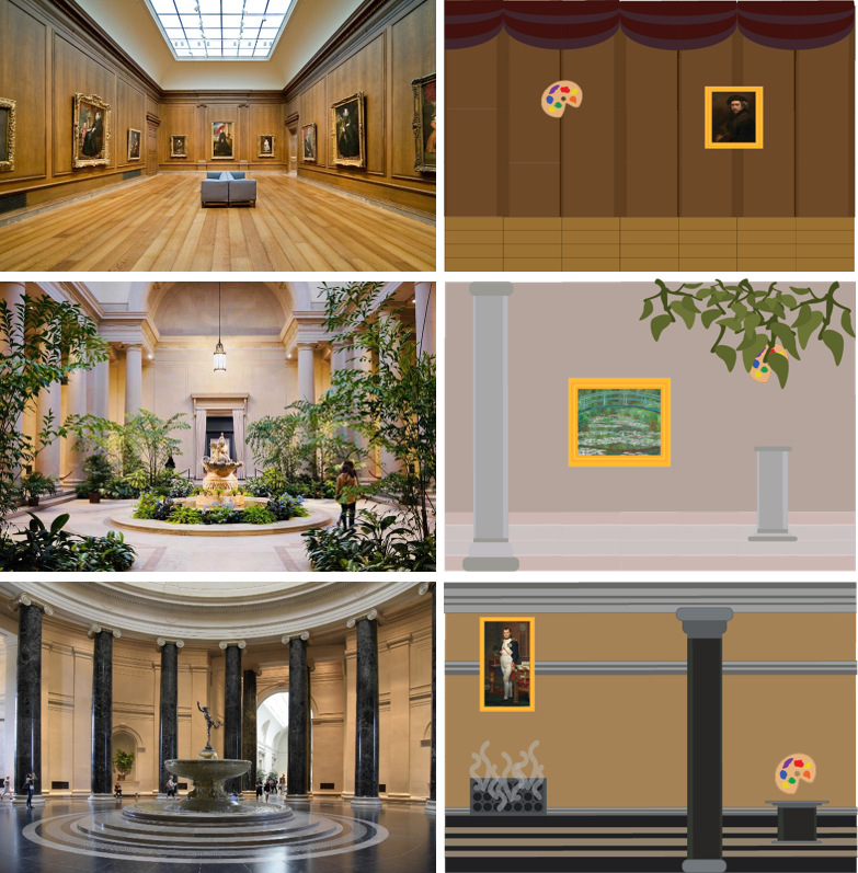
This inspiration is also seen in the paintings the player must collect throughout the game. All the paintings featured in the game are real pieces of art that can be viewed at NGA.
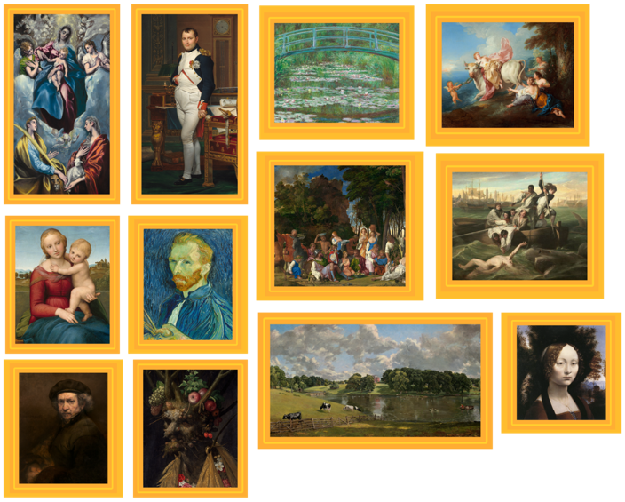
To learn more about why I chose to use NGA as inspiration check out this post from my blog.
Characters
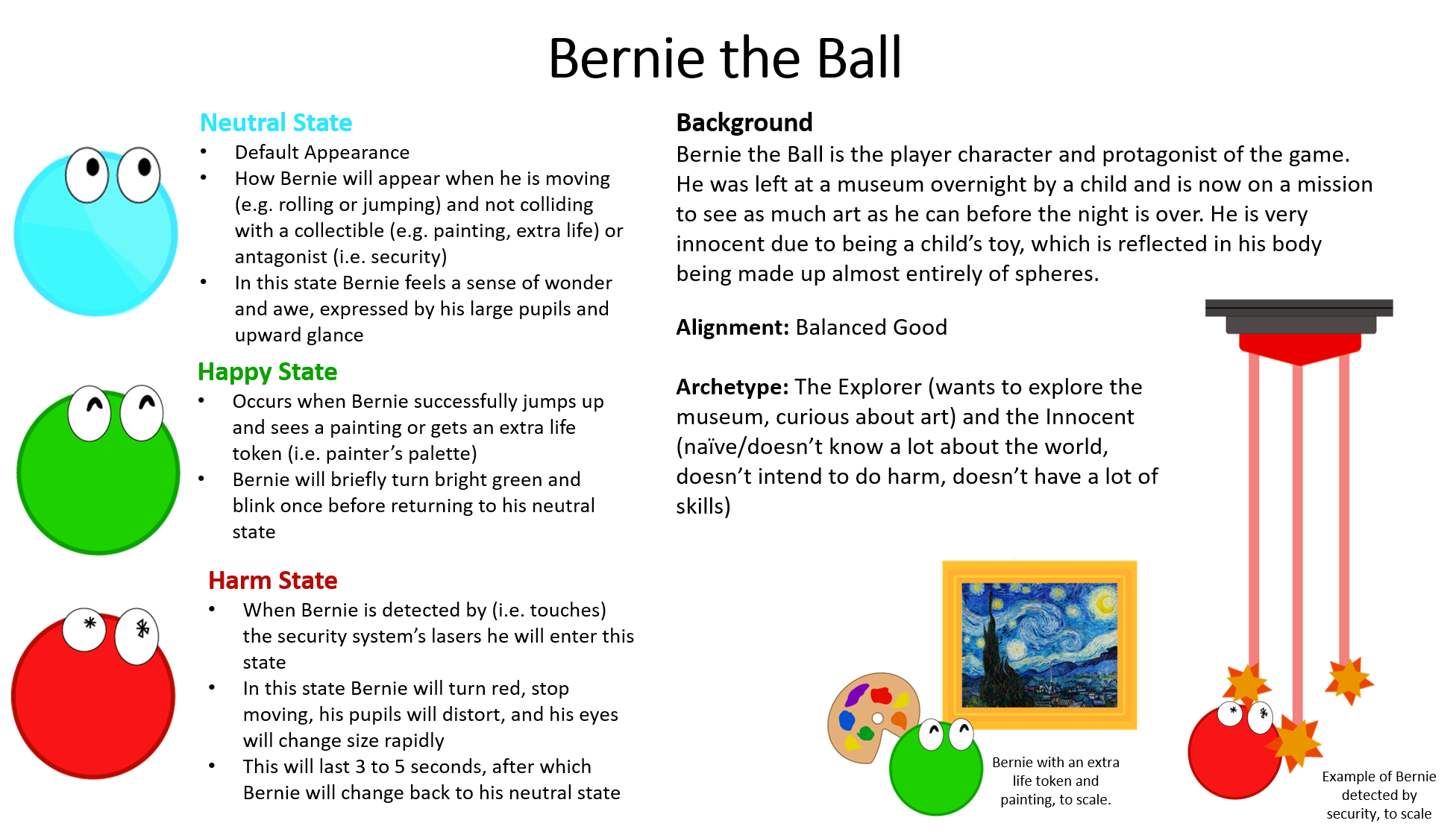
I decided to go with a simple design for the characters. I used a circular design for the player character to reflect his innocent nature. Having the player character be a simple shape allowed for the change in color when harmed or happy to be more noticeable, emphasizing the emotions those colors are meant to invoke.
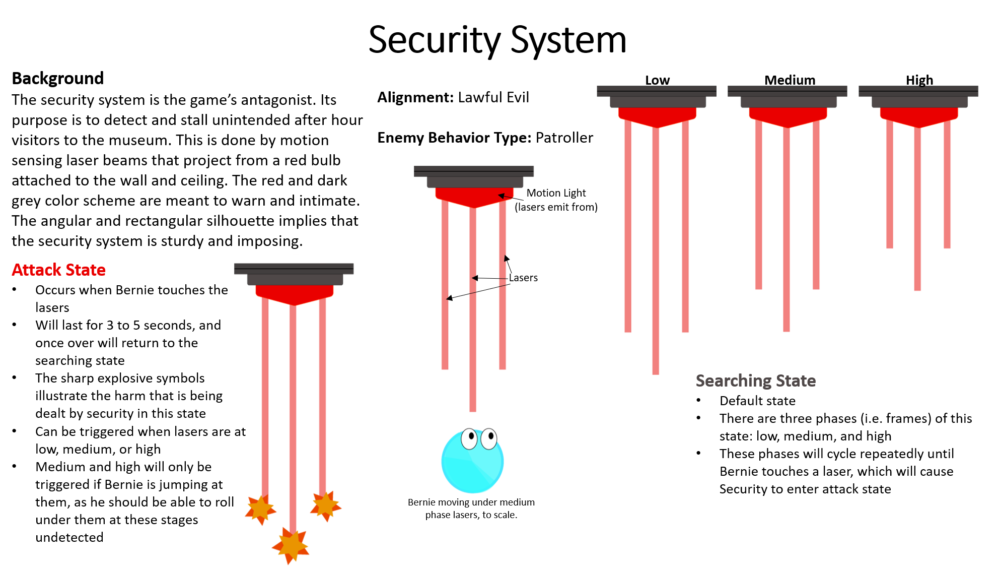
For the antagonist, I utilized sharper angles and a darker, more intimidating color palette. Red features heavily in the antagonist as a way of warning the player.
Since the characters and collectibles feature bright colors, I wanted the environment to feature mostly neutral colors. The main reasons for this were to keep the game’s visuals from looking too chaotic, to have the characters and collectibles not clash with the background, and to have the brighter colored objects stand out more.
Mockups
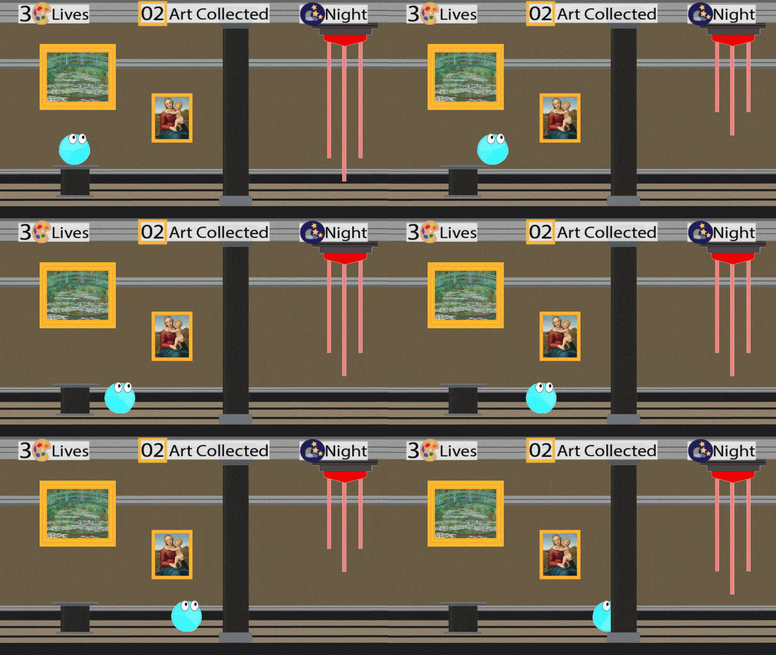
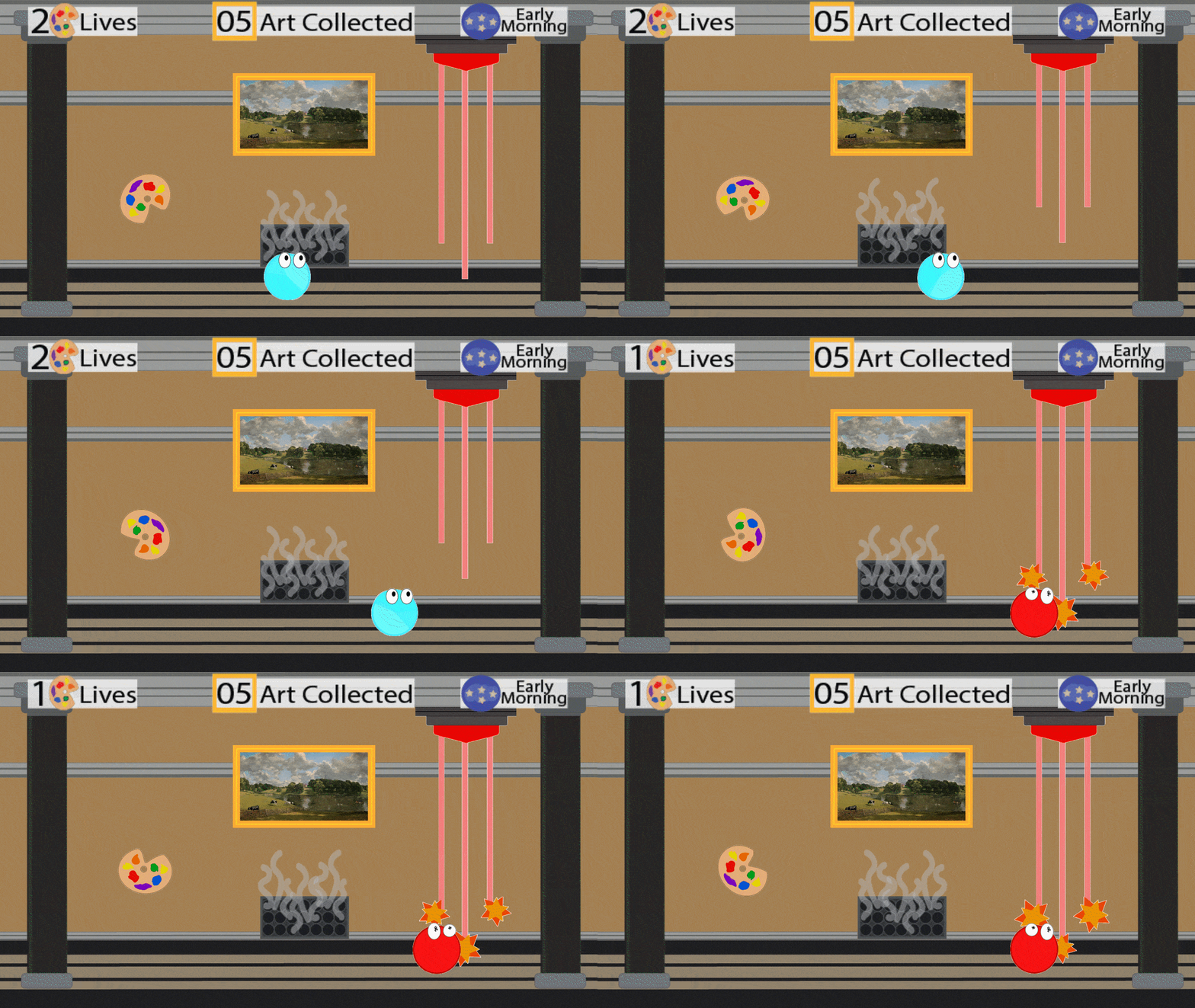
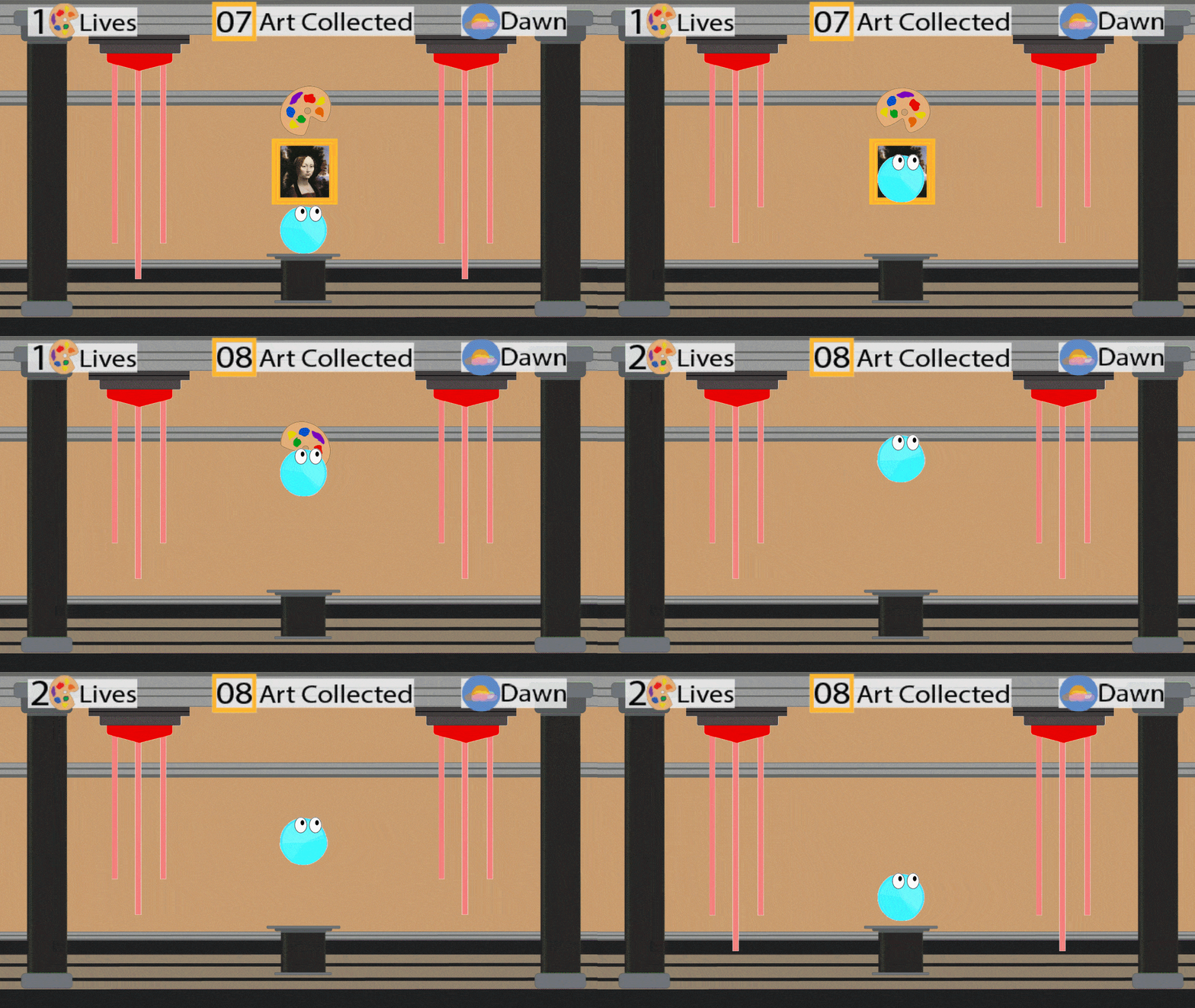
There are 3 phases in the game: Night, Early Morning, and Dawn. The following gifs represent part of each phase, with the UI element in the upper right hand corner indicating what phase each is.
Phase 1: Night
Phase 2: Early Morning
Phase 3: Dawn
| Status | Prototype |
| Category | Other |
| Author | Manatee Amazonia |
Leave a comment
Log in with itch.io to leave a comment.